 Entry #25 (2011-10-05)
- Voting has closed and you chose blue with gray by 56 to 44 percent.
Poker1 will open using one of two color themes
- Scroll down to vote, to see screen shots of final head-to-head choices, and to view results of previous polls.
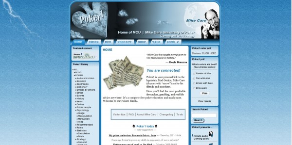
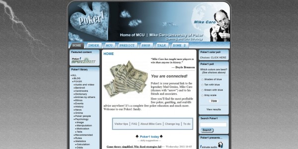
Your comments and votes regarding the color choices for the official Poker1 opening have been very useful. Thank you! You have chosen the "shades of blue" design. However there were numerous comments that — taken in bulk — seem to indicate it might be "too blue." Maybe not. In any case, it's time for you and me to make a final decision and move on. I've designed one last alternative, called "blue with gray."
Which colors are best?
(See choices above)
- Shades of blue
(42%, 33 Votes)- Tan with blue
(28%, 22 Votes)- Gray scale
(15%, 12 Votes)- Green with blue
(14%, 11 Votes)Total voters: 78
Loading ...
You may vote once. After you do, only the results can be seen. Here are the choices for the vote above…


Note: So far, over 400 color-related comments and votes have been received during the Poker1 beta-test period. As of today (2011-10-05), you can read 11 of 23 comments below "Why a new Poker1? Tournament insanity (Caro blog)" that talk about colors. You'll find 21 comments under "Poker1: Terrible, annoying, old-fashioned? (Caro blog)." You'll find 16 comments under "My apology to web designers (Caro blog)." You'll find 50 comments under "Poker1 “quiet color” test (Caro blog)." You'll find three comments under "One final color alternative (Caro blog)." You'll find at least 50 other color-theme comments scattered below other entries at Poker1 and in the P1 forum. Over the last year, there have been over 100 replies to color-related posts at my Facebook page. There have been 27 e-mails (mostly to poker1@caro.com) commenting on the Poker1 colors (or lack of colors). Polls In the last few days, we've made two color polls available at Poker1, resulting in 159 votes. In the first three-choice poll, without "shades of blue" included, 34 visitors voted for "tan and blue," 34 (tie) for "green and blue," and 14 for "gray scale." In the four-choice replacement poll launched yesterday, 32 visitors voted for "shades of blue," 22 for "tan with blue," 12 for "gray scale," and 11 for "green with blue." Head-to-head vote appreciated So, obviously, there has been significant interest in the Poke1 color designs during beta testing, and I want to choose wisely. We're still headed in a non-glitzy, quiet-learning direction with these final two choices. It's a head-to-head, final match-up. Please vote! — MC
3 thoughts on “Vote: Head-to-head Poker1 color war (Caro blog)”
Leave a Reply
Leave a Reply

Is this final already? Haven’t visited for a while. I like the all-gray color. Blue is too common, just as white and black themed sites are. But where do you see a gray website? Very few and Poker1 was one of the few I remember having it.
I tried to vote for blue w/ gray, but it wouldn’t let me.
Computer voting is rigged!!!
Lis~
(Like both much better)
Hi, Lis~ —
If you’ve already voted, you won’t be able to vote again. You’ll only see the results.
If there’s a different issue, please tell me which browser you were using when it occurred.
Thanks for the report.
Straight Flushes,
Mike Caro