- By Mike Caro | Exit
 Entry #23 (2011-09-30)
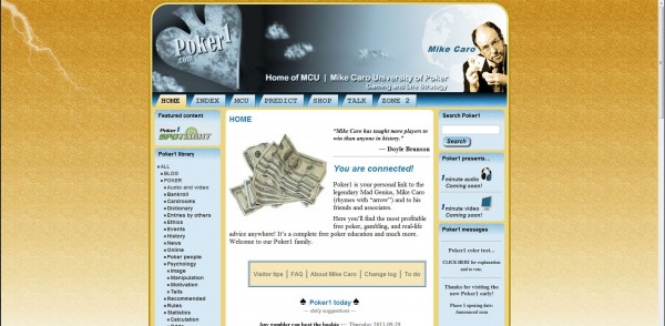
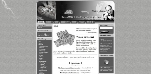
Do you like gold/tan or green with blue? Or original gray?
Please comment below.
See Poker1 “quiet color” test (Caro blog)
to catch up on what’s happening so far.
NOTE: There is currently a poll on the right sidebar that you can visit to choose your colors. You will no longer see that poll after Sunday 2011-10-09.
You can see the two alternatives below: The recent gold/tan and blue version; and the original gray-scale version. Today, the new green and blue option surrounds you.
Which?
We will open with one of these three choices. Please let me know which you prefer by leaving a comment below. Thanks! — MC


Mike –
I’d like to suggest rethinking the whole color deal. You are creating a brand – “branding yourself” and your site. Scrap the whole deal and try going here:
http://colorschemedesigner.com/#
Play around with everything, I suggest especially trying the “mono” – the site will give you all the hex codes and so forth and the RGB and create various schemes for you to look at, including webpage mock-ups.
I’m sorry, these are not good colors, IMO. BTW, #dad3ca will give you a very good clean light tan/taupe color. A darker version of that is #B7A997 Try this with blue, and darken the blue a bit, maybe #1E417D. Then use gray for your “3rd” color. I bet you’d like it better.
I could be wrong. But I got a dollar says I’m not. Personally, for branding I like basic monochrome style with one bright accent sparingly used. One good blue set with a fine red line here and there, that sort of thing.
Personally, I like the gray. Gray with a splash of good red #990000. A border, a link, a whimsy.
Try the site, anyway. I mean, when I buy my Poker 1 t-shirt – I want them to know what it is from across the table without glasses!
But you can make it puce and lime and I’ll still be here.
Lis~
Hi, Liz~ –
I like that “Color Scheme Designer” site, especially for the “monochrome” tool, which provides a good selection of compatible shades. Two colors – opposites on the color wheel – is a simple-to-use process there, too, although I frequently use this technique, anyway.
Actually, I have a great deal of color selection software, and I usually choose manually, no matter what software I’m using (draw, photo, web, whatever). I still like the gray scale, but I’m trying to find two colors (as an alternative) that don’t scream too loudly, but call out quietly.
I’m not sure whether the gold/tan with blue did that better than the green with blue. However, I’ve always liked green and blue together, and in some cultures they are just different shades of the same color (and they blend mid spectrum).
I don’t want to change the blue, because too many elements are already designed based on it. So it’s down to gray scale OR this powder blue with a different contrasting color.
Thanks for posting your thoughts. They were greatly appreciated.
Straight Flushes,
Mike Caro
I’ve spent a bit more time on the site you recommended. It’s quite useful and I bookmarked it. Thanks, Lis~. — Mike Caro
Green/Blue
Blue and Gold obv
you have a great site Mike keep up the good work.
Hard Rock Poker Open soon Come on down to Oklahoma
You’re getting there… a little Gob Green. I think the blue is the hanging point. I’m not trying to offend the “lovers of blue” but blue is not seen too much around poker. Unless you use the colored decks that Mike loves. I think Gold and Green and less pastel!
Green/blue is great!
Gold tan… !! The green/blue is too cold. But definitely color please.
I like the gold/tan and blue …. must admit none of the options are funky… the colours seem to make the site look a little outdated
The green is so acidic man, cooooooooooolllllllll.I wanna be a puppy dawg.Can you make that happen?
gold/tan
gold/tan
I like today’s blue/green option. Alittle more lively than the greyscale, yet easier on the eyes than the blue/yellow combo
I like the gold/tan and blue version best!